Budget Forward
Budget Forward is a holistic approach to budgeting. The website and app's key features include personal finance educational content, integrated bank data to track spending, financial goal planning and analysis. Budget Forward’s target users include all genders, ages 25-65.
This is a student project.
My role
Accessibility Designer
UX Product Designer
UX Researcher
Responsibilities
Wireframing
Prototyping
User research
UI design
Accessibility
Branding

Project overview
The problem
Many budgeting apps are expensive,
non-customizable, lack educational resources, and only offer month-to-month views of the user's finances.
The goal
Create an affordable way for users to track spending, learn about personal finance, make plans, and see the big picture of their finances.


Accessibility
I plan for accessibility throughout each stage of development.
These are a few examples of what I include in the design phase.
Color
Each time I used color for text and icons, I utilized the WebAIM Contrast Checker to test the contrast ratio of the foreground and background colors.
Annotations
I included annotations in the Figma file. The markers placed next to interactive UI elements indicate to the engineer how assistive technologies will move through the app.
Hierarchical headings
I designed a typography scale to help screen readers better understand the hierarchy of each page.
Labels
I included descriptive language to the interactive UI elements on the page to help users of assistive technologies better understand and navigate each page.


User research
Pain points
Education
Budgeting apps do not teach you how to organize your finances; they only track your spending.
Long term goals
Budgeting apps typically only offer a monthly analysis of spending. Users want to see a big picture.
Planning
Users don’t always know how much to save and invest in order to achieve financial security.
Customization
Many budgeting apps do not allow users to create a customized budget or savings plan.
Usability Study
Parameters
Study type
Moderated usability studies
Location
United States, remote
Participants
4
Length
20-30 mintes
Findings
Visual aids
Having visual aids in the app helps users clearly understand the navigation.
Budget category
Users preferred to have "Budget Name" in the edit page, changed to "Budget Category Name"
UI preferences
Users unanimously disliked pop-ups
Tracking goals
Users would like to see if they are on track for goals such as budgeting and retirement.
Summary
A moderated usability study, followed by a system usability scale, allowed me to test the usability and functionality of the onboarding process and the budget feature. The goal was to create an intuitive user flow that allows users to set up an account quickly and offer an easy-to-use, customizable budget feature.

Sitemap
Four main app features: Learn, Budget, Plan, and Insight.

Digital wireframes
Users quickly see the available budget, tasks for the week, assets and debt, and featured educational content.

Available budget helps the user keep track of spending
Goals set by the user
to keep on track
Overall view of assets and debt
Educational material empowers users
Homepage
Similar to the app homepage, the desktop homepage shows a glimpse of each feature.

Homepage
Prototype
The user opens the app and sees the homepage. From there, they can navigate to the four main tools.

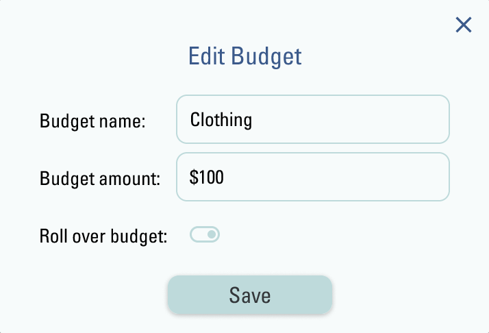
Edits
Users preferred to edit the budget categories on the same page instead of a popup.

Before usability study

After usability study
Users responded that the label “Budget name” was confusing and preferred “category” instead.
Before usability study

After usability study
Prototype screen variations

Takeaway
Impact
As a UX product designer for Budget Forward, I contributed to creating an intuitive and inclusive platform that empowers users to manage their finances with ease and confidence. By adhering to UX best practices, I designed a seamless experience that simplifies tracking spending, learning about personal finance, and making long-term financial plans. I prioritized accessibility throughout the design process, ensuring that the app is inclusive. The result is an affordable, user-centric solution that helps users gain a clear financial overview and supports them in taking control of their financial future.
Lessons Learned
Having lots of ideas for an app is great, but listening is critical in every stage of development. The more I learned about accessibility, the more I realized how many people I was excluding. I began researching accessibility and how I could design products that are more inclusive. I learned that being inclusive doesn't start and end with thoughtful design. Making an intentionally inclusive product means taking steps during the research, testing, and design phases, as well as handing the designs off to the development team. The part of this project I am most proud of is the knowledge I have gained to make future products more inclusive.
See my other case studies
Whimsy is a platform for parents to buy and sell gently used children’s clothing, toys and gear.
This case study demonstrates my thought process for accessibility, designing, prototyping, user flow, and creating a design system and style guide.

Pattern Sphere is a startup designed to provide a database of patterns that help address systemic problems.
This case study showcases my approach to user research, including developing personas, user journey maps, and applying insights to improve the project onboarding process.
